@bobbrown you need to do this
report(vcat(pk_log_plots, avg_pk_plots),
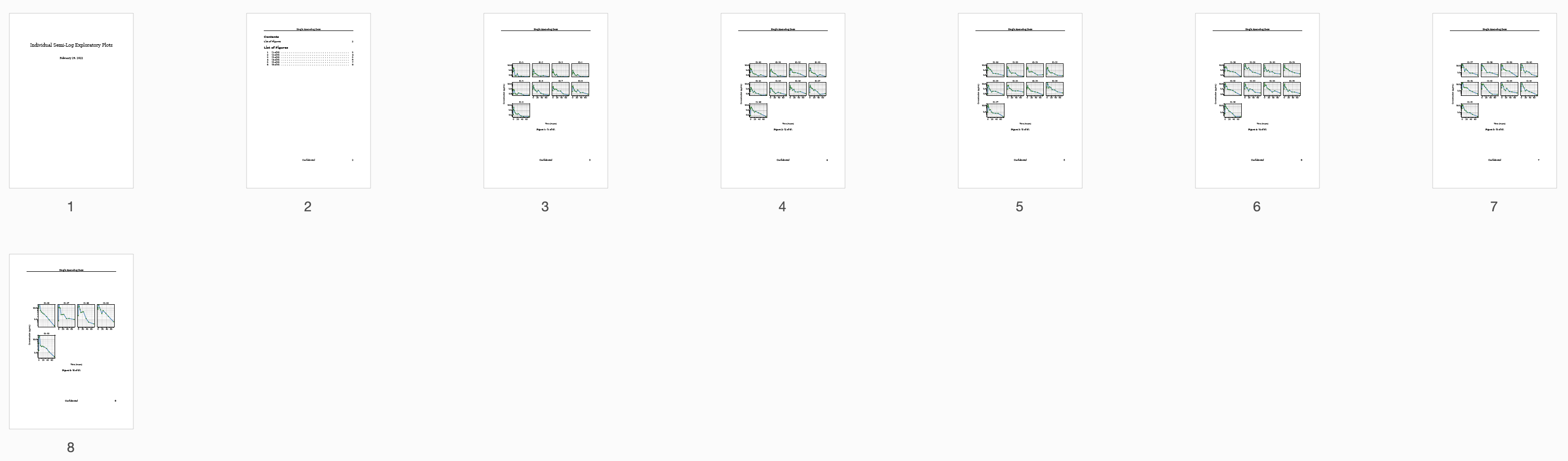
title = "Summary and Individual Semi-Log Exploratory Plots",
output = "./practice/nibr/data/plots",
header = "Single Ascending Dose",
footer = "Confidential")
some other julia experts can weigh in here, but the pattern of concatenating two vectors in julia is that you need to split the vectors into individual elements using ... and then put them together. See the example below.
julia> a = [1,2,3]
3-element Vector{Int64}:
 1
 2
 3

julia> b = [4, 5, 6]
3-element Vector{Int64}:
 4
 5
 6

julia> [a, b]
2-element Vector{Vector{Int64}}:
 [1, 2, 3]
 [4, 5, 6]

julia> [a..., b...]
6-element Vector{Int64}:
 1
 2
 3
 4
 5
 6

#UPDATE: Based on Michael's response below
julia> vcat(a, b)
6-element Vector{Int64}:
 1
 2
 3
 4
 5
 6
The report function only takes a vector of plots and not a vector of vectors.
We are happy to have these discussions, Please keep them coming!
That would be awesome, please share your experiences. In the meanwhile, for those reading the thread, I summarized all the code required till now below.
using Pumas
using PumasUtilities
using Dates
using CairoMakie
using AlgebraOfGraphics
using DataFramesMeta
df = CSV.read("Single_Ascending_Dose_Dataset2.csv", DataFrame, missingstrings = ["NA"])
df = @rsubset df :TIME >= 0
@rtransform! df route = "ev"
##  map NCA data from CSV
ncapop = read_nca(df,
                id  = :ID, time = :NOMTIME, amt = :AMT, route = :route,
                observations = :LIDV,
                group = [:DOSE])

#plot means
avg_pk_plots = summary_observations_vs_time(ncapop,
                                  color = :black, linewidth = 2, whiskerwidth = 8,
                                  paginate = true,
                                  limit = 1,
                                  axis = (xlabel = "Time (hours)",
                                            ylabel = "Concentration (μg/mL)",
                                            yscale=log10, ytickformat=x -> string.(round.(x; digits=1)),
                                            yticks = [0.1, 1, 10],
                                            ygridwidth = 3,
                                            yminorgridcolor = :darkgrey,
                                            yminorticksvisible = true,
                                            yminorgridvisible = true,
                                            yminorticks = IntervalsBetween(10),
                                            xminorticksvisible = true,
                                            xminorgridvisible = true,
                                            xminorticks = IntervalsBetween(5),
                                            limits = (nothing, nothing, nothing, 30),
                                            spinewidth = 2),
                                    #facet = ( combinelabels = true,),
                                    figure = (resolution = (800,800),
                                                        fontsize = 22),)

pk_log_plots = observations_vs_time(ncapop, paginate = true, color = :black,
                                axis = (xlabel = "Time (hours)",
                                        ylabel = "Concentration (μg/mL)",
                                        yscale=log10, ytickformat=x -> string.(round.(x; digits=1)),
                                        yticks = [0.1, 1, 10],
                                        ygridwidth = 3,
                                        yminorticksvisible = true,
                                        yminorgridvisible = true,
                                        yminorticks = IntervalsBetween(10),
                                        xminorticksvisible = true,
                                        xminorgridvisible = true,
                                        xminorticks = IntervalsBetween(5),
                                        limits = (nothing, nothing, nothing, 20),
                                        spinewidth = 2),
                                        columns = 4, rows = 4,
                                        facet = ( combinelabels = true,))

report([pk_log_plots..., avg_pk_plots...],
      title = "Summary and Individual Semi-Log Exploratory Plots",
      output = "./practice/nibr/data/plots",
      header = "Single Ascending Dose",
      footer = "Confidential")
Hope this helps!